If you have a website or a mobile app, you’re probably curious to see how well it’s performing. How many visitors do you get each day? What is your busiest time of the day/week/year? Where does most of your traffic come from? What traffic sources leads to the most sales or conversions?
And if you’re not asking these questions, you should be! Understanding the data behind your site can help you make informed decisions about where to allocate resources, which new features to implement on your site, and where potential problem areas might be.
Where to Get the Data
The best way to get the data is by installing Google Analytics on your site. This allows you to track all site visitors (anonymously) and learn from what they do – and don’t do – on your site.
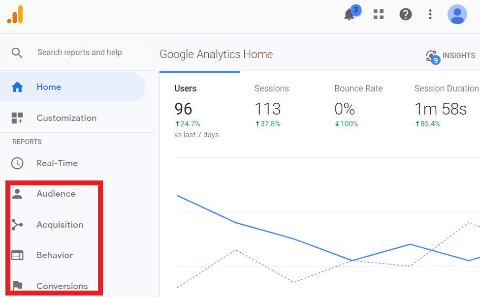
Google Analytics offers data on almost anything you can think of. Maybe even too much data; at times a newbie can have trouble sifting through and making sense of it all. We recommend starting from the top, viewing data from the four main content areas Google breaks the data into:
- Audience (who is on your site)
- Acquisition (how did they get there)
- Behavior (what are they doing on your site)
- Conversions (how do their actions contribute to your goals)

Four Core Data Sections in Google Analytics
You can also install other tools, such as Inspectlet, to record visitor sessions on your site or app to glean further insight into user behavior. In all cases, if you’re using cookies to track visitor behavior, you’ll want to mention such usage in your privacy policy.
What Data to Get
Which data you pull will depend on your organizations’ goals, needs, and interests. Ask yourself what you are trying to accomplish with your website or app, and work backward from there.
For example, if you’re a non-profit, you might accept donations on your site. So you’d want to track;
- The number of donations
- The dollar value of those donations
- Where the people who donated came from (which site referred them to your site, what city are they in, etc.)
- Which pages of the site they visited before making their donation
- How long they were on your site
- Which other actions they took on your site
For an e-commerce site, your goals would be different. And for a website that highlights your company’s services but where the actual transactions take place offline, those goals would be different as well.
How to Present the Data
Within each page of Google Analytics, you can export the data into a PDF or a spreadsheet. The PDFs are great for a quick report and the spreadsheets work well if you want to dive in and manipulate the data. However, neither is particularly user-friendly.
When presenting to higher-ups, it’s useful to have visually informative snippets of data organized in a thoughtful way that allows them to get the overall picture. For this, we recommend either pulling everything manually into a carefully designed Word document (which is free but laborious) or using an automated reporting tool like DashThis. We’re huge fans of DashThis because the reports are extremely user-friendly and can be customized for virtually any information you’d like to share. They even have templates you can use to get started.
We recommend starting with a basic report, reviewing it with the key stakeholders in your organization, and making iterative updates based on their feedback. Often, people aren’t sure what they want without some sort of starting point, so we recommend you view your reporting task as a collaborative and ever-changing process instead of a one-and-done to-do item.
Making Sense of the Data
Here’s where it all comes together. After working your way through all the steps above, you’ll (hopefully) have a nice-looking report loaded with data. But what does it all mean?
Vicki Lesage, one of our digital marketing strategists, was quoted in an article from DashThis on reporting best practices:
Auto-generated reports like DashThis are great time-savers and provide a streamlined, consistent format, but the true value to your client is being able to explain what they’re seeing and help them make data-driven decisions from it.
The best way to learn how to analyze the data is from experience. Look at your reports each month and observe what stays the same (i.e. establish your trends) and what changes (i.e. spot the anomalies). Slice the data in different ways to try to better understand WHY it’s happening, then compare that against your business goals and processes to see HOW you might want to change things.
For example, it’s one thing to notice that the majority of your site visitors go to Page 2 of your product listings. It’s another to notice that most sales also come from Page 2. And it’s yet another to conclude that perhaps you should increase the number of products displayed per page or reorder the products so that the products people are buying most are visible with fewer clicks/scrolls.
Need Help?
Even if everything in this article makes sense, you might not have the time or the resources to do your own monthly reporting. We’re happy to provide training on Google Analytics with one of our Google Analytics certified experts, set up a reporting template for you, or provide monthly reports for you with complete analysis and recommendations for improvement. Drop us a line and let us know what you’re looking for!
